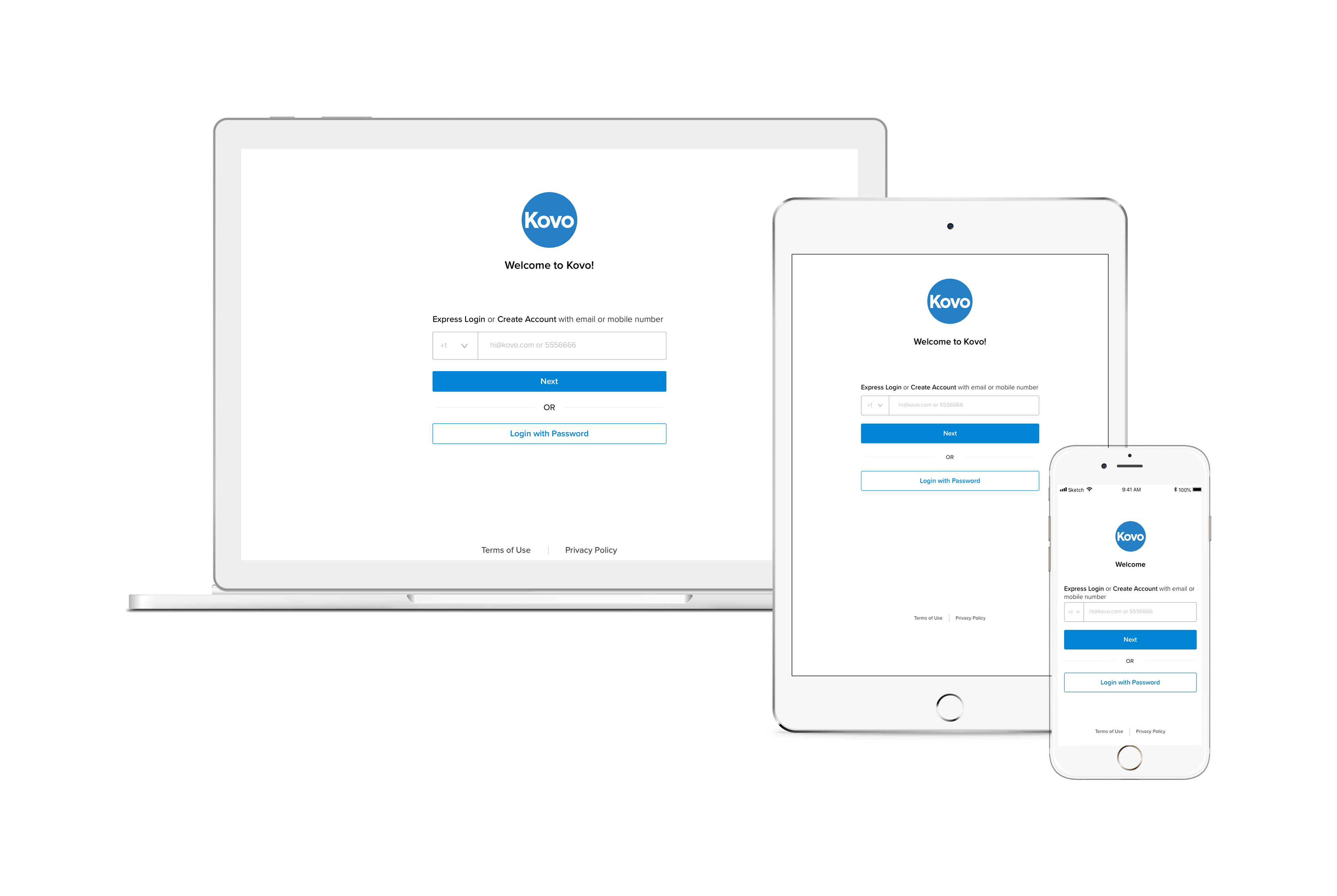
Kovo Progressive Web Application
Led the design process from identifying problems to turning ideas into solutions, new experiences, and product improvements.
Role: Product Designer
Timeline: August 2018-September 2019
Project Overview
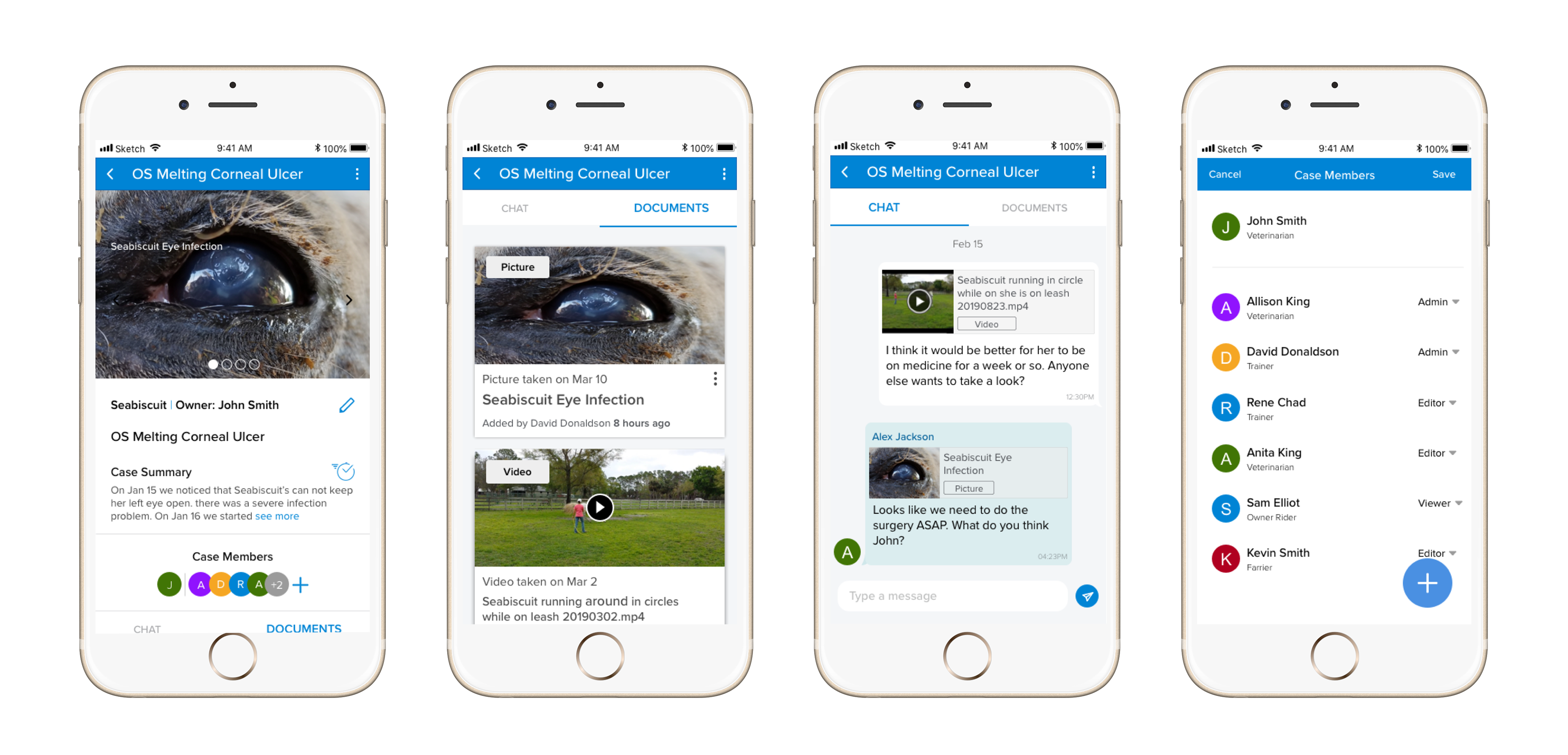
Kovo is a progressive web application that provides a SaaS platform for vets, trainers, owners , riders, etc in the horse industry to capture and share medical-grade information about a horse. Our goal in this project was to find the users hassles in the current version, redesign and improve the product, and add new features based on users and business needs.
Problem
Feedback from the previous version of Kovo demonstrated that there are some pain points for the users interacting with Kovo. This had resulted in lack of understanding of Kovo's invaluable features which led to difficulties expanding the user base.
My Role
I owned the end-to-end design process in the company. I have identified problems, gathered users and business needs, and turned them into solutions, new experiences, and product improvements. I am actively working on ideation, validation, and iteration in very close collaboration with PM, developers, and QA in an agile environment.
Research
The research process had two phases as I was working on both UX improvement and adding new features to the app.
USABILITY TESTING
First did a usability testing on the current app to gather user's feedback, finding their frustrations with the app, and the areas of UX improvement. All information has been analyzed and helped us improve Kovo’s overall interaction experience.
USER INTERVIEW
The second phase of the research involved doing user research by interviewing users, creating personas to know what are Kovo user's days look like, and how a new feature in Kovo could help their work-life be easier and more productive. This lets us add new features to Kovo based on the user's needs.
User Flow
I created a user flows for different new user paths in Kovo to communicate the new features with stakeholders. I iterated on user flows before moving to screen design.
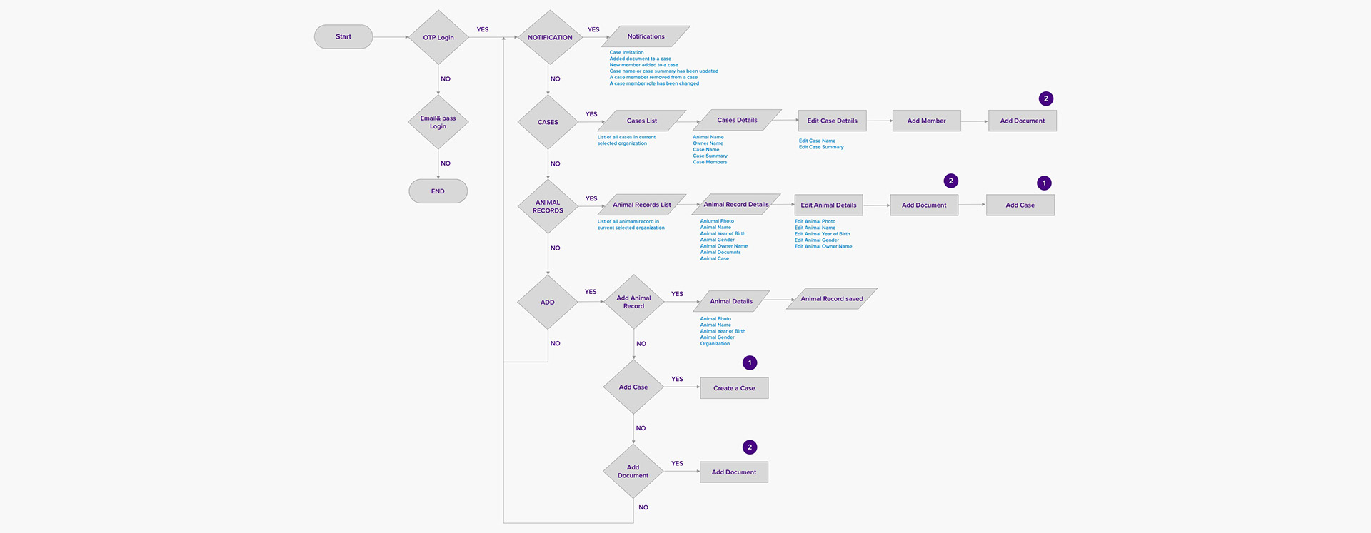
Kovo User Flow
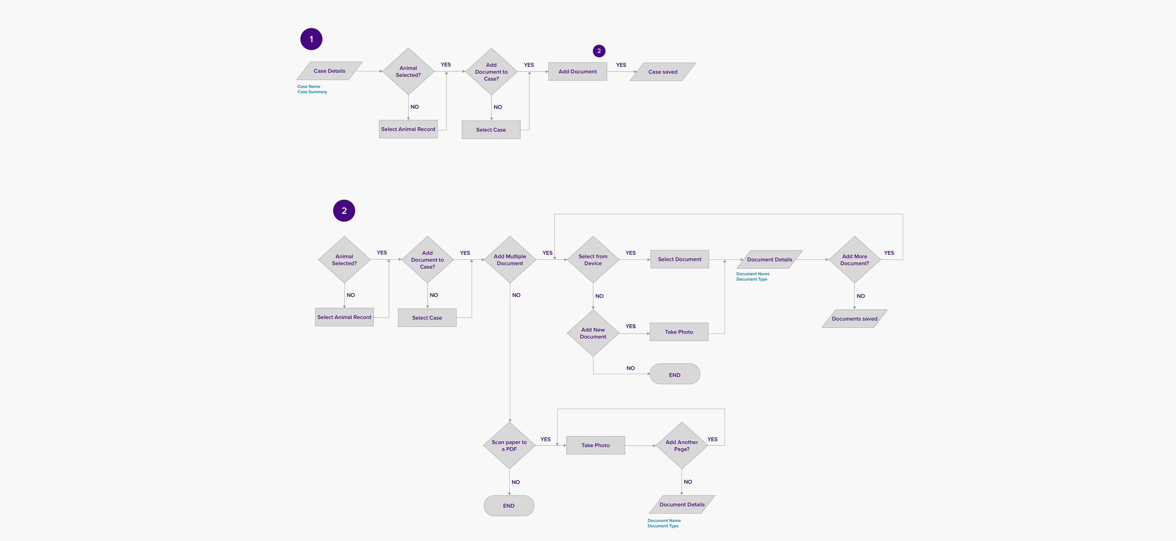
Kovo User Flow
UX Challenge 1
One of the critical challenges for the Kovo users in version3 was discoverability. We observed that after logging in to Kovo, new users were confused about where to start and what to do. They were faced with too many options. And they ended up spending a lot of time figuring out their way in the app. The main problem was the lack of clear call to action.
Solution 1
Discoverability is important in mobile devices where there is a limitation on screen size. The solution I came up with was to just show the main actions. First, I chose three main navigation tabs with the necessary information that users needed to see.
Second, I proposed to use a FAB(Floating Action Button). As we wanted users to be able to do the main actions from all navigation tabs, we changed the FAB to an expandable one which included three main actions: add document, add animal record, and add a case. This solution will help users find the commonly used actions much easier. They would not be confused and did not need to think too much for the simplest interactions.
UX Challenge 2
One of the valuable features of Kovo is viewing/sharing DICOM studies(a type of medical record). As part of the process of importing DICOM studies to the Kovo app, there was a possibility of creating duplicate animal records for the same animal. This could be the result of a typo in animal information or the fact that horses can have multiple names in different clinics or barns. These would show up as separate records to the user which is clearly undesirable.
Solution 2
The proposed solution was two fold. First, give the user the chance to consolidate multiple records; this was called a merge. Second, was to allow them to revert what they might have done by mistake and separate merged records, this was called unmerge. For the former, similar records were identified by the system and a notification would be sent to the owner of records and they could simply merge the records. Unmerging was another simple action on already merged records.
Wireframe and Visual Design
I created low fidelity wireframes to present several solutions that I wanted to incorporate into the design. For each solution a wireframe was created and presented to the stakeholders. Several iterations of discussions and feedback helped finalize the design before moving to the high fidelity design. I was also responsible for creating style guide.
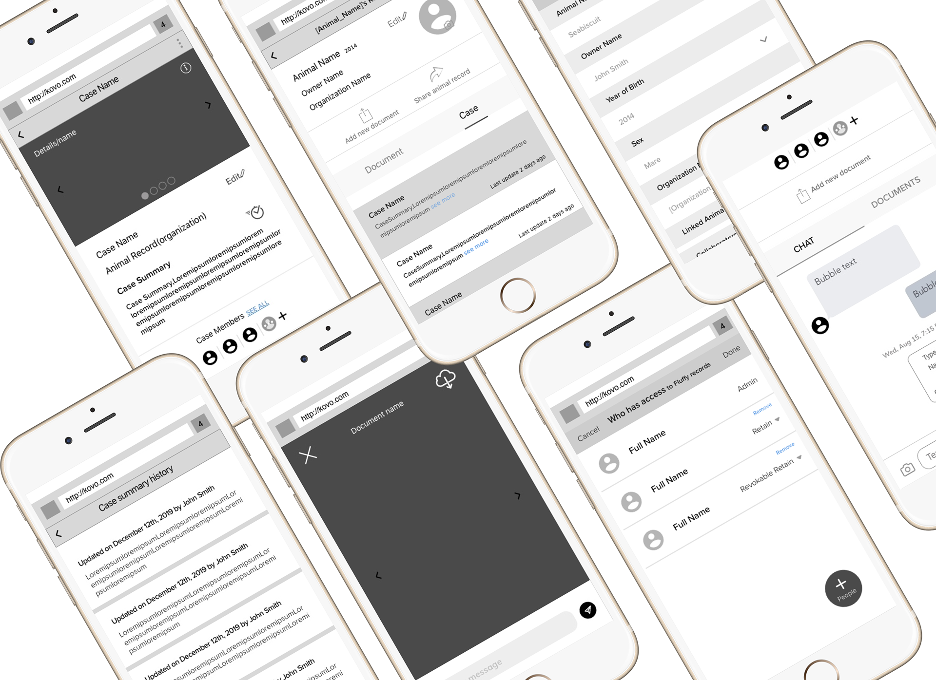
Wireframes of Kovo App Screens